Improving Data Grid (Table) Design: A Generic Design

Tables have evolved during the age of HTML. Nowadays it is more reasonable to make the difference between tables and data grids (aka data tables). A table is a visual data arrangement with rows and columns whereas a data grid is a table formattedĀ arrangement of complex data and behavior. For example, in data grid you typically can search, filter, select, etc. data. You often see also actions for the data items – either single or bulk actions…

Designing data grids is not easy, and there is no single correct design that would fit for all use cases. The correct design is what fits for the purpose. However, there are some common features which I expect to see in a well-designed data grid. Also, many of designs out on the internet have decent design and user experience. But to me many of the implementations are not really outputs of a design process. So I wanted to design one of my own.

Data grid layout follows the design that I have found working well: it has header, menu and/or app bar, footer, left section, middle section, and right section. Left section is reserved for navigation where as right section is reserved for actions and/or details. The middle section is where the data will be located. As depicted in the image, there will be also optional part that is reserved for options depending on the context.

Data grid layout

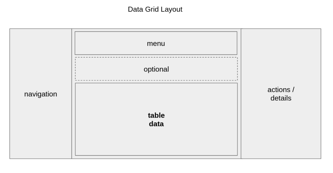
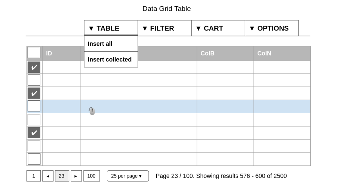
Table data is one part of the layout. Let’s concentrate on to it next. There are tabs:

  • TABLE tab for viewing and selecting all data
  • FILTER tab for searching, filtering and selecting all data
  • CART tab for viewing selected data. User can insert and remove data (rows) from different views: the analogy would be shopping cart in web shops
  • OPTIONS tab for extra functionality

There are some important design choices too

  • Any row in any tab should NOT contain buttons or actions although it is a fairly typical approach. IMHO, it leads into bad UX. However, it is totally okay to have links – especially text format links. Actions should be displayed the right section (as discussed earlier). The analogy for actions is that you can think of it so that when you click a link in a column of a row it will open up “mouse right-click” view in a separate pane.
  • There will be single and bulk actions. Bulk actions can be executed only in the CART tab where it is possible to “remove all” and “remove selected” rows. This leads also to a meaningful separation of selecting and collecting. Selection should be understood so that the user clicks or touches one row which makes the row selected (or unselected with another click or touch). When user’s selection is marked by checking a checkbox, it will be defined as collecting it. Collecting/dismissing is done using the check marks.
  • When the user wants to collect all rows of a (paginated) page, they can click checkbox in the first column: checking it makes all rows collected, and unchecking makes all rows uncollected. If there are rows collected before clicking the checkbox, all of the rows become collected i.e. uncollected rows become collected. But note that the checkbox make only one page collected!
  • So how to collect all rows? Especially if the number of rows is large: for example let’s say 1000+ rows. IMO, the correct approach is to use Table tab menu where there should be options: “Insert all” and “Insert collected”. In the CART tab where the collected rows are visible, there will be only a mark that “All rows selected”, and there is no pagination because practically speaking going through so many pages is just not possible for humans.
  • Different extreme cases where grouping should be used are
    • “All rows selected” (as discussed)
    • “No rows selected” (it is not a good practise to display nothing on page)
    • “1000+ rows selected” (custom max. limit has bee reached)

Actual design of the table data part is show in the image. As said, there should be possibility to collect items (first column). Compared to many other designs the only new thing is the tabs, which is done because we don’t want to have Actions on rows at all.

Data grid table data design

There is still one unsolved issue: what if your SQL-query is a view using JOINs and having multiple million rows. In UI, humans can process only about 1-1000 rows. This means that result set size must be made smaller:

  • There can be a Query builder that narrows down database query and therefore the result set as well: the more exact query, the less result set items
  • It can be that the result set of the database query is still very large, for example tens of thousands of items. But since UI will still accept only a sample size of max. 1000 items the UI will display only “All” option
  • Whenever the result set size, after making the discovery/search query more exact, is less than 1000 items, they are displayed in the UI
  • When there are 1-1000 items in the result set, then they displayed in the UI as rows of the data table.

So we can say that there are three important parts:

  1. Database contains all rows
  2. Search function queries a subset of all rows
  3. Filter function can be used for exploring the subset

Improving Usability of Material-UI Transfer List

improved transfer list

Material-ui.com provides React components for faster and easier web development. It allows you to build your own design system, or start with Material Design. What a fantastic effort and free to use! But not all of the components represent great design / UX unfortunately. Some of the components design is just copied from the “old” internet. And you guessed right, one of those components is the Transfer list. Transfer list pattern is also known as List builder pattern. The good thing about it is that it uses other components as building blocks. But still, the UX of it is just not up to par of the design system – cf. most of the other components.

There are many alternative designs for similar functionality. What I found useful were post from clearly experienced designers. One of the best posts actually tried to understand user behavior by collecting data and analyzing it: you must check it out from medium!  Another good post was Nielsen’s Listboxes vs. Dropdown Lists“. It should be pretty obvious that there is no one correct design, but some work better in certain context. For example, in the medium post the Foursquare badge based method is showcased.

One major trend is that a big proportion of the website visitors use mobile devices, which have inherently smaller screens than desktop/laptop computers. The Transfer might work with mobile devices but it is not a good match. The documentation states that it is meant for moving items from one list to another. To start with, the buttons are not intuitive nor they describe what they do. Users who are not familiar with this pattern might be afraid to click them – i.e. lose control. Next thing that comes into my mind is that what if the lists are long. You need to choose between showing all the lists in one screen or showing less list items in each list.

material-ui transfer list
material-ui.com Transfer List design

So this got me thinking. Could I try to contribute somehow. Well, I certainly can try: here is my proposal for improving the Transfer List UX. The design is based on general filtering pattern where filtering is reversed i.e. all of the data is available, but only for additive action first. This means that the secondary list has initially zero items. Later, when the list has items, the user can remove them from there with reverse action i.e. remove items.

The different lists are on top of the component: represented as a Toggle button. By clicking the button the user can switch lists. Optional filtering text field means, of course, filtering through the list items – whether “Select” or “Selected” in this case. Note! The filter itself should allow selecting: “All” and “None” options enable selecting all or none of the currently available items (i.e no checkbox next to an item). List content is shown/listed next. The gray arrow is not really part of the design, but it represents the presence of the vertical scrollbar for scrolling through items if there are too many to show all of them on the screen – according to some UX best practises the scrollbar is needed if there are over 6-7 items. Nor is the filter text field needed if all of the item fit into space reserved for the vertical list. You can select an item by checking the box in front of the text – and unselect it by redoing the action. Selecting an item should make it unselectable/disabled: it should not disappear from the “available” list so that the user seems every item in the list; but “selected” list should contain only selected items! Finally, the button on the bottom is used to execute the action – in this case adding the items to the “Selected” list. The opposite action is of course “Unselect items -“. That’s it, what do you think? Should this design replace the current design?

Web Form Design 101 (With Validation)

For some reason it seems that form design is left out in the UI frameworks like Material UI (MUI). Maybe the use cases are always too different to come up even with a single opionated design, because there is none. This post tries to lay out basic principles for a simple form design that includes:

  • How to use material design forms “correctly”
  • According to identified best practises
  • Assuming design is mobile first, but plays well with desktop too
  • Aiming to make forms more conversational!
  • Leaving multi-step forms aka. wizards outside the scope

Let’s get started.

The UX design part

Good list of UX sources for form design:

Good list of UX sources for form validation errors:

About animations, which IMO is really effective when used correctly

Basic scenarios.

  • user inputs wrong data -> single field immediate validation
  • user submits form -> life-cycle of form and groups validation
  • validation errors
  • submission errors

Reading through the sources I have identified the following best practises:

  1. Single column design
  2. Group related fields together to form logical sections – groups can be optional too – then must be marked as optional – don’t use (*)
  3. Ask as little information from user as possible – but incrementally
  4. Mark optional fields instead of mandatory ones, and use the ā€œOptionalā€ label to denote optional fields. – don’t use asterisk (*)
  5. Field label is fixed and above the the text field. Don’t use floating labels, and don’t use captions
  6. Don’t use placeholders, but prefer masked input if needed.
  7. Typical structure for the field row: [leading icon] field [trailing icon]. The field itself: [icon | text] value [icon | text | action]. Text can be e.g. the unit like EUR, $, kg, etc. In MUI icons are InputAdornments and they can contain action. Action can be for example dropdown (see combo-box) or open calendar…
  8. Avoid select lists – it should be your last resort
  9. Validation error messages AND helper texts are placed under the input field. Use tooltip on-hover next to label when user might need extra information, help, suggestions, etc. – but avoid using tooltips for errors!
  10. Validation error messages must be informative: e.g. how error can be repaired. There are many guidelines which involve validation errors: see Nielsen articles for this
  11. The submit button should have clear click-to-action text: not “Submit” but “Create account” (verb-object)
  12. Opionated, but IMO there can be cases when two buttons are required: then link button for “Cancel” and real button for CTA i.e. different styles for primary and secondary buttons

A note for complex forms or forms with a lot of fields (some of them optional and/or infrequently used): “hide irrelevant control” is a goodĀ guideline! So for example, when using a query builder, the query builder should beĀ compassable of parts, which user can select. This of course means that the query builder itself must be buildable – build a query with a query builder builder (no mistake here…)!

The implementation part

Types of inputs

Materia UI:

  • React components for faster and easier web development

Formik:

  • Getting values in and out of form state
  • Validation and error messages
  • Handling form submission

Yup:

  • Build a schema that defines allowed values
  • Validate input values against the schema
  • Multi-language support

If you are going to implement this in React, let me know. To this date the best set of technologies would be Formik for form and Yup for validation. But even here you notice that things are not thought through: you need this and that to integrate formik to material ui: for example https://stackworx.github.io/formik-material-ui/ (Easily combine formik with Material-UI).

Improving Your Grandad’s Web UX Pattern: File Upload

File upload. It was cool back in the 1990s when Internet was invented. Ever since it has been used, but never really improved until big companies like Google, Microsoft, Dropbox started to invest in web technology. And even still there are new players claiming that file upload is still a problem that needs solving: at least Resumable File Uploads.

What is file upload anyways? Why do we need it?

  1. User needs to move a file between desktop computer and a remote computer. It is easy way…
  2. Relatively secure due to browser sandbox technology
  3. Browsers are and work everywhere

But in an ideal situation, would we need it at all? Ideally:

  • The file doesn’t to be transferred – it is magically where you need it
  • User can just select the file and here the simultaneously the upload is removed, which should lead into simpler error cases
  • No upload means not waiting, which leads into great UX!
  • This virtual drive could be mounted everywhere i.e. user has one connectable drive that can be shared across different services as a “remote local” drive (cf. Dropbox)

Practical solution and thus the new File Upload (UX) Pattern:

  • A shared directory to where files are uploaded before using them (so yes, in a way an new extra step at this point)
  • An upload can be done using different options: existing HTTP form upload, object storage, IPFS, mounted NFS, webdav, whatever…
  • Synchronous, asynchronous, parallel upload for both UI based upload (form) and API based upload (HTTP, Ftp, gRPC, …)
  • HTML5 based file manager (GUI) and virtual drive: normal HTTP based upload is one offered method, but other integrations are possible too as mentioned. See Dropbox or Google Drive for an example.

Modern file upload pattern

Let’s assume that there is a web form with a submit button. In this example, you send your name, email, and personal photo to register to an online webinar. The important part is how photo upload happens:

  • A user sees a empty form with input fields.
  • The user selects image for a personal photo
    • The user’s virtual drive (similar in UX to what Dropbox or Google Drive has) opens up. This is functionality is called “file manager”
    • The file manager is shown with upload/download file options
    • The user selects “upload from my computer” and file manager uploads it normally (using asynch file upload protocol)
  • The user goes back to the registration form
  • The user selects the photo from the virtual drive (this is possible only after the photo is completely uploaded) and a preview is shown
  • The user enters name and email and hits submit to send the form
  • The user registration is completed!

So what is different? Often the file upload happens when the form is submitted, which is the grandpa -pattern. The new proposed pattern transforms the way file upload is thought: you should think like every file is already at the remote location and you choose the file as you would on your local desktop computer – or on your mobile too.

Dropbox.com

For implementing client-side functionality for uploading files you can use ready-made libraries like uppy.io (see image below for a screenshot):

uppy.io

P.S. When you do file upload like this, you will receive additional benefits like possibility to do file conversions (for example with pdf-tools pdftron or with pandoc or with libreofficelibreoffice-script=soffice --convert-to pdf --headless <FILE> --outdir <DIR>“), file versioning, (internet) file printing, file content preview server, etc.

UI and CLI Are Equivalent!

The idea? End-user’s interaction with webapp in a browser has equivalent command line command sequence! And how to avoid duplicating interface implementation for CLI, UI, and API? The answer is that the API should be the master API and both the UI and the CLI should use that. We can also go further and force UI to transform its API requests into CLI commands so that CLI can execute them. So in short, the pipeline could looks like this:

UI/Browser -> CLI -> API

For example, let’s imagine there is a service called “Deals” that informs you when there are good online deals available in your favorite online stores. If the user “john.smith@example.com” types his email address in a form field and hits Submit button to register himself to a new service, the equivalent textual CLI command could be “deals register ‘john.smith@example.com'”. Nowadays for example gloud service providers prefer using CLI – at least to cover most complex interactions.

Modern web application often consists of fronted (Javascript) application, application programming inteface (REST API), and backend. A concept in modern programming languages it a tool called Command Line Interface (CLI) that allows for example Repeat-Eval-Print-Loop (REPL) loops. Nowadays strict separation of the frontend from the API and backend is a popular design choice. I will claim that the following is true and that treating UI and CLI as interchangeable concepts is the future of web apps:

  1. Frontend is separated and it is independent from the backend. HTTP requests are text.
  2. Interactions which come from the UI should be formatted as they were native CLI commands and queries. This new idea has immediate impacts:
    – every UI command and query can be translated into CLI alternative, and vice versa
    – API must accept them as-is
  3. When backend implementation gets changed the API contract must not be changed.
  4. When frontend, i.e. UI, is changed the visual appearance should not changed always. It can change, but it should not be obvious that it changes. Changes increase cognitive stress for end-users, and typically require educating them.
  5. CLI can but not must require interaction with a user, which is programmatic automation requirement!

Automated testing is still quite difficult and the tests are brittle. What if you could test browsers by using visual AI to recognize different DOM elements and compare different interactions with textual output! The whole point is that text is still the de-facto way of communication in computer systems. The UIs exists because they hide complexities and improve discovery. So I propose that make your UI CLI compatible, allow users to use CLI alternatively, require textual input and output in APIs, and finally understand that visual layout should not change always when implementation changes – it is a contract too. . And see my other post about Human interaction Interface (HII)

P.S. There is interesting development going on related to this topic: see for example CLUI that is about how to build a graphical command line tool! In a way, also command-line auto-completion is also a UI: see for example client for PostgreSQL.

P.P.S. Another interesting development project is the tool that allows you to turn (almost) any Python Console Program into a GUI application with one liner.

Stop Changing My UI, I Don’t Want New UI!

The problem: with a new software there usually comes a new user interface (UI).
The solution: decouple UI from implementation, and continue using and iterating existing UI instead of building a new one.

Analogies:
* Google Material design: the visual design is the brand, but also it “is a visual language that synthesizes the classic principles of good design with the innovation of technology and science.” You can easily create web app components which implement the design. Also, on technical level components can expose an API for modifying them. I would like to extend the idea of design and contracts to the UI level to solve one very common problem. End-users are loaded with continuously changing applications. I argue that sometimes the UI should NOT change. For example medical systems. To summarize, Material design decouples design from implementation.

Existing old features should work the way they do now and not change visually or behaviorally, new features must follow the existing design and extend the functionalities of the existing app.

– end-users must learn new system means cognitive load
– old features change and might break (regression)
– new features are often the reason for starting using a new system

But there is a way: what if we start thinking User Interface (UI) as a contract.
– companies would actually own the Intelligent Property Rights (IPR) to the UI (and to automated tests written against it)
– (frontend) app itself would be separated from the backend app with an API (RPC, SOAP, REST, etc.)
– UI functionality must remain the same, no matter what changes in the backend: visual and behavioral contracts!!!
– software supplier can be changed: both frontend and especially backend

Benefits:
– end-users would not need to learn old ways of doing things, new features would accumulate meaning end-users can learn delta i.e. what has changed
– testability: ability to write automated UI tests with frameworks like Katalon or Robot.
– collecting and analyzing usage could be more long term and stabilized. Would allow improved end-user insight and control over features life-cycles.

Summarized: Accessibility A11Y (For Developers)

Accessibility means web accessibility in this post. What is it? Let me start by a brief motivation: why should you care? First, for human reasons most importantly. From WCAG: “Web Content Accessibility Guidelines (WCAG) 2.1 covers a wide range of recommendations for making Web content more accessible. Following these guidelines will make content more accessible to a wider range of people with disabilities, including accommodations for blindness and low vision, deafness and hearing loss, limited movement, speech disabilities, photosensitivity, and combinations of these, and some accommodation for learning disabilities and cognitive limitations; but will not address every user need for people with these disabilities”. Second, it improves user experience (UX) for all. And third, there are regulatory reasons for this too: in EU there is the Web accessibility directive and in US there is a similar law called ADA. However, the laws currently don’t affect most of the private companies, but it might change in near future.

So what is it? Web Content Accessibility Guidelines (WCAG) 2.1 improves especially technical accessibility in internet. It has “12-13 guidelines that are organized under 4 principles: perceivable, operable, understandable, and robust. For each guideline, there are testable success criteria, which are at three levels: A, AA, and AAA.” Usually the target level is AA that also includes level A (AAA remarking full accessibility)! There is a summary which gives you a quick glance to it, which helps you get the “big picture”: https://www.w3.org/WAI/standards-guidelines/wcag/glance/. There is also a checklist which help you with how to meet the WCAG requirements. There also tools which you can use to evaluate your web content accessibility. It might be worth noting that there are many consultancy companies which sell accessibility audit/workshops. Some examples of technical tools for evaluation:

  • Achecker tool checks single HTML pages for conformance with accessibility standards to ensure the content can be accessed by everyone. See the Handbook link to the upper right for more about the Web Accessibility Checker.
  • WAVE Web Accessibility Evaluation Tool: WAVE is a suite of evaluation tools that helps authors make their web content more accessible to individuals with disabilities. WAVE can identify many accessibility and Web Content Accessibility Guideline (WCAG) errors, but also facilitates human evaluation of web content. 
  • Constrastschecker for checking accessible colour contrasts

You also need to have a public, regularly updated, accessibility statement on your website: see the templateACCESSIBILITY STATEMENT“. In Finland, you can use a builder to create it for you. In short, the statement should include:

  • What parts of your web site are not accessible, and reasons why: is it work in progress, not under regulation/law, or an unreasonable burden for some (what) reason
  • Feedback mechanisms for users to report inaccessible content
  • Possibility to access your relevant information in accessible format
  • A link to the enforcement procedure

Human Interaction Interface (HII)

What is Human Interaction Interface (HII)? It is a term that I invented to describe a potentially useful extra layer on top of representation layer (MVC) on the client side… It is a concept similar to that of Google’s layer for separating style from design (Material Design). Now HII is about separating user interaction from the user interface (i.e. the representation)

 O 
-+-
 | 
/ \
---
HII
---
MV*
---
API
---

The User Interface (UI) does not cover the interaction, which means true physical interaction between a person and software running on a piece hardware. We do need a way to model the this interaction between physical human world and digital computer world. You can argue that for example HTML forms already provide means for this (with mouse and keyboard), but there are certain problems with them. First and foremost, the HTML is not easy to test. Improvements would definitely be beneficial in this domain.

Although modern web browsers implement many WEB APIs they could benefit from an Interaction API. There are some existing efforts made in UI markup languages which abstract application development using XML. For example, VoiceXML and JavaFX are represented in XML format, but they could be rendered into HTML as well. Another way of looking this is visual flows in BMPN frameworks: inputs and outputs only are relevant. Anyways, the Interaction API would allow getting rid of HTML when defining application behavior.

When writing automated tests for a web application using React, I found myself writing HTML selectors (for Selenium) for Katalon/Robot framework. Now, the selectors themselves are pretty brittle, but most importantly the development flow goes backwards: I was writing selectors and adding element ids after I had already completed writing the app itself. There is nothing wrong with re-factoring code to make it more testable per se, but the changes I made caused me to add more code and the code became more messy – definitely not the right direction. And automated testing is a basic requirement for a high quality app.

My tests follow the usual pattern of Arrange-Act-Assert (AAA), and they are mostly automated end-to-end tests, which allow effective testing targeting end-user value. But again, because of how web apps are coded, the tests themselves became cluttered. I noticed that I would definitely benefit from being able to clearly define what are the required inputs from the user and the outputs from the system. For example, a user registration flow could require user’s email address, and the system would generate user name for the registered user.

But what is the Human Interaction Interface (HII) then?It sits between user and hardware that is used for controlling both inputs and software. The interface defines needed input and outputs which are required for specific flows. In Katalon, for instance, I end my test with an assertion which checks that all outputs for the end-user are given. And please note, this is a final check at the end; often tests just wait for certain (fixed) output from the system, but in my case the assertions cover the whole end-user path.

And before going any further I want to stress that figuring out user inputs and system outputs, creating arrangements and checking assertions against outcomes is REALLY painful when doing it by selecting HTML elements or attributes and checking their values etc. Automated testing is painful when HTML is present. Cleaner representation leads into easier testing…

If you have ever coded VoiceXML (VXML), you will have easier time to understand where I am going at. Since the “computer” is a telephone and the “keyboard” is the keypad, it is easier to realize that the “computer” awaits user’s input in a specific position. It is in a way “aware” of itself – it would be better to say that it is aware of its state. Typically internet apps are controlled by the user and thus the browsers are not aware of their states. HII makes it possible to define the sequence for interaction with the computer. And it also stores relevant user inputs and system outputs to the flow. And as stated: it is intelligent, so it knows what input is expected from the end-user. This (meta)data can be used for automated testing!

So how does my idea differ from the VXML or similar. Well, I would borrow and combine keywords into my idea. Keywords are keywords how they are defined and used in automated testing frameworks like Robot or Katalon. What I really like about the keywords is that they provide quite abstract and high-level means to describe WHAT. Keywords can contain variables which can be resolved and populated dynamically like in Ansible!

But there’s even more potential when you consider Accessibility (A11Y): many websites using HTML are lacking logical flow structures, which is not the case with for instance VXML. When the logical flow is present in HTML pages, it also makes it accessible: for example navigating the site using keyboard and a screen reader. Another way of putting is that websites are often missing semantic structure, which is partially solved with accessibility.

P.S. To retrofit this kind of feature in HTML5 is difficult. I would suggest trying to store some of the flow data to HTML tree where it can be accessed with normal testing selectors… Inspiration could be taken from Page Object Model (POM).

Correct Design of HTML5 Wizards and Form Inputs and Buttons

I have been trying a lot of different designs for form inputs but simply nothing seemed “to “work” visually… Finally searching for different design alternatives I ended up recommending the following. A form input should consist of three parts:

  1. First part is an icon (e.g. font awesome icon), some text, or an image. If you click area of this part, it expands to cover the whole input: this “boolean switch” type of behavior allows, for instance, using it to show and to hide help instructions. Of course, doing it again (twice) means reset.
  2. Second, i.e. middle part, always contains input from a user. If user has not entered anything, i.e. an empty input, the text should advise user about what data should be entered to this input (commonly known as watermark text). Side note: always keep whatever user has entered to it and don’t automatically change it: even if it is invalid content.
  3. Third and last part should be an action element that allows interaction with user. Visually it can be an embedded button with some text, or text like asterisk ‘*’ indicating a required field, or green check icon for validated and approved content, or red cross icon for an invalid field value, or kind of a split button that reveals more options when user clicks it. So whatever is the last element it should offer a binding to events: whether it is submit button or something else, the idea is to respond to a user (inter)action. Interesting enough, this could be also a Drag-and-drop area for files!

About colors. There are at least four different use cases for both data and form elements:

  • normal color (default)
  • focus color (e.g. blue)
  • validated content color (green)
  • invalid content color (red)
  • submit button color (gray if disabled), when enabled other color with white text

Color coding for buttons:

  1. disabled or passive (alpha layer)
  2. enabled or active (normal color)
  3. primary action (frequent user action)
  4. secondary (n-ary action, for less frequent or less important actions
  5. interaction (hover shows button is selected + pushing it down for action)

When value is invalid, where should an error message be displayed and how? First of, there should be a “grouping” message indicating overall result, e.g. an overall message for the user stating if anything went wrong. In addition detailed error messages should be displayed too: preferred style is inline messaging right next to an erroneous field. The field with an error will be marked with red border, perhaps light red background color and darker red text, and a cross-icon/image/text as the third part. A user sees this and when he/she clicks to this field to fix the error (onfocus event in field) an inline message is be shown to the user. The user sees both the input text and the error message at the same time, so that he/she can fix the error easily: user should receive either instructions how to fill field value correctly, indication of where the error is located, or both. The error message disappears (temporarily) when user stops editing the field. Another important aspect is a tool-tip. Using tool-tip text is highly recommended, because it can fit more text than any other place in your design.

Dialogs like Sign in, Sign out, Sign as, Sign up, etc. should be in fact Wizards (with Cancel and Finish buttons that might have different labels though). A good example is a sign in (login) dialog: login is actually a login wizard meaning that it should provide flow of Cancel-Next, Prev(ious)-Next, … , Prev-Finish action options: however, login is just Cancel-Finish flow. Typically you would see some mistakes in this implementation like possibility to close the wizard dialog window, or having all the buttons Cancel, Prev, Next, and Finish at each wizard step/page (even if some of them are disabled at times).

User should not be allowed to stop the flow prematurely, but rather, fast-forward to the end always, which in practice might be invisible to the user. To make it faster to complete the flow, i.e. skip unnecessary steps, (parent) wizards should have hierarchical/inner/nested (parent/child) wizards which just group and wrap data into logical parts. In addition, flows typically have visual indicator on both current phase and completion stage. In short and as a rule, correct wizard design is such that a wizard always has exactly one and same entry and also one and same exit point, and the flow itself should be considered as “atomic”.

Simplest wizard according to these rules is Cancel-Finish (in login “Finish” word is replaced with a word “Sign in”). Note that flow should be usually defined left-to-right meaning Cancel and Prev buttons are located left and Finish and Next buttons are located right. There are at least two types of wizards or flows: a wizard that allows you go backwards and forward, and a wizard that goes only forward. For example, a lost password recovery wizard should go only forward and therefore have only button sequence of (possibly multiple) Cancel-Next and Cancel-Finish, i.e. no back-navigation: logically this means that you will have to restart recovery flow if you stop it before you complete it.

signInPassImage 1
signinFailImage 2
A good example is a sign in (login) dialog: login is actually a login wizard meaning that it should provide flow of Cancel-Next, Prev(ious)-Next, … , Prev-Finish action options. Actually, only “Cancel” and “Sign in” buttons are needed in this simple flow! Also note that users should not be allowed to close dialog window, but use the “Cancel” button.

Beautiful isn’t it! Oh, and one last thing. As I wrote already, a dialog should almost always show the result or outcome of the executed operation: or non-existence of it too! For example, if a user selects a paint for his house and then buys it with “Buy” button, the operation is obviously also called “buy” and after the execution there should be feedback available: either user bought the paint or something went wrong and he did not get it. Note that this feedback is different from the input field feedback and it could be understood as “button feedback”.

P.S. If you are searching for a product for creating complex forms, there are two possibilities: Orbeon Forms (orbeon.com) or Form.io form (form.io) – there is also form.io and Camunda integration plugin!